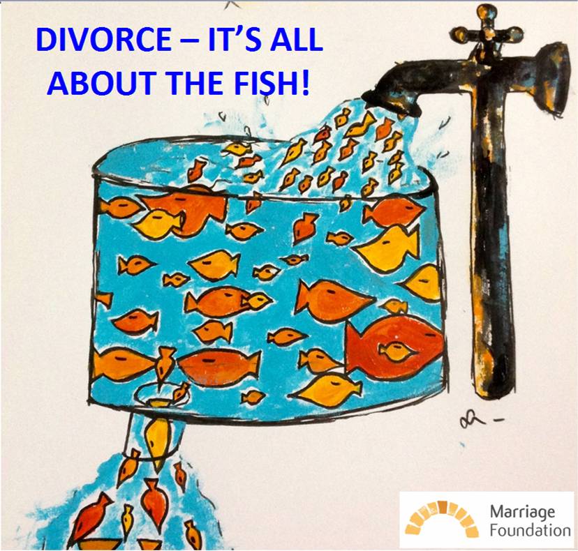

Imagine an enormous fish tank. In it are fish of all different sizes, all swimming around happily together.
It’s easy to tell how long any particular fish has been in the tank because of its size. As fish mature, they get bigger. The bigger fish have been around for a long time. The smallest ones are the new arrivals. But they all swim in the same tank together.
Now move your eyes upwards to the top of the tank where there is a giant tap, through which pours a steady stream of fresh young fish. These are the new arrivals, minnows. You can watch them quickly mixing in to the general melee within the tank.
As your gaze drops down to the bottom of the tank, you see a giant plug, out through which pours a stream of fish of different sizes. Most are fairly small. But there are bigger ones leaving the tank as well.
What this fish tank represents is marriages. Each fish represents one couple, its size reflecting their length of marriage to date. The tap at the top is where newlyweds enter the tank. The plug at the bottom is where divorces leave the tank. The tap at the top – marriage rates – pours in new fish at roughly twice the rate that the plug a the bottom – divorce rates – sucks fish away. You should be able to see now why there’s no direct connection between marriage rates – the smallest fish – and divorce rates – fish of all different sizes.
Last week, the Office for National Statistics announced that there were 6 per cent more divorces in 2016 compared to the previous year. That’s 6 per cent more fish disappearing down the plug.
But for those of us looking for the overall trend, knowing that a few more fish left last year doesn’t tell us whether this is because more fish of all sizes are leaving (divorces are up across the board) or because there’s a sudden rush for the plug by more of the smaller or bigger fish (divorces up among newlyweds or longer marriages).
Alternatively, maybe there are simply more fish in the tank this year. Who knows.
I hope my fish tank analogy helps you see the problem. Merely counting the fish that go down the plug each year tells us not very much about divorce rates.
So what we do at Marriage Foundation is divide the big pool into lots of little pools.
Within each little pool, all of the fish are the same size because they represent all of the marriages in one given year, whether 1970 or 1985 or 2008. The good bit is that if you ask ONS nicely, and pay them a small fee, they will tell you how many divorces happen for each year of marriage.
Now we can keep track of how many fish go down the plug in each of these little pools. By dividing up the fish by size, or year of marriage, we can get a really clear picture of the trend. We can look at the newer tanks and see how newlyweds are faring. We can also look at the older tanks and see how the longer marriages are faring. And, crucially, we can compare how those newlyweds and older couples are doing compared to their counterparts in the next door little fish tank!
Whereas the overall headline – the giant plug – gives us fairly useless data on divorces by “year-of-divorce”, looking at divorces in their individual tanks, by “year-of-marriage”, gives us a very clear idea of the trend in divorce rates.
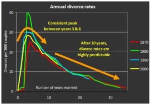
This is how we have found out that
- Divorce rates tend to be highest during years three to seven of marriage, and decline steadily thereafter
- The seven year itch is therefore a myth, and always has been
- So is the idea that hordes of empty-nest couples split up when their children leave home
- Once couples get to about ten years of marriage, their risk of divorce reduces every year and is highly predictable
- All of the change in divorce rates therefore happens in the early years of marriage
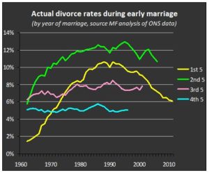
So what about this year’s rise in divorce?
Buried away among the new divorce stats (so well hidden that they aren’t even on the main website), ONS report a very limited summary of data on how long the latest batch of divorcees have been married. Because the pattern of divorce rates is so well established, I can extrapolate from these numbers with confidence, and thence update each of my fish tanks accordingly.
So here’s what is really happening
- Despite the headline rise in divorce, couples who married in 2011 now have the lowest divorce rates over their first five years of marriage of any group since those who married way back in 1973.
- These five year divorce rates are now 42 per cent lower than their peak twenty years ago, among couples who married in 1991.
- Divorce rates in the second five years are also on their way down, but not so markedly.
- If you want to know where last year’s rise took place, it was among couples who had been married for more than ten years.
Next time you hear a commentator claiming that “divorce rates are up” because of Brexit or economic worries or some other made-up reason, you can tell them about the fish.
The young fish are doing just fine.